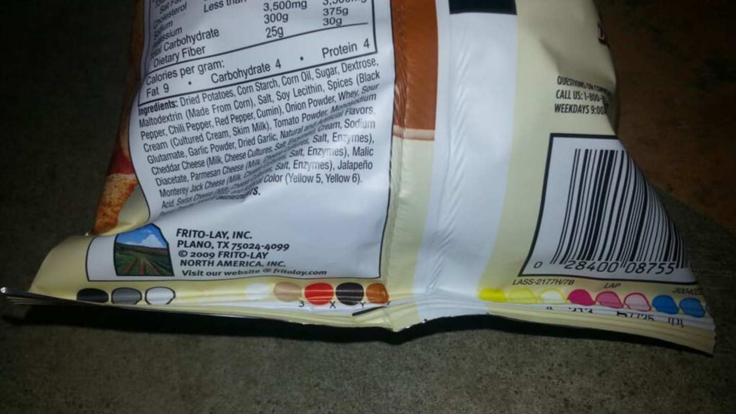
Ever wondered about those colorful squares or circles on your favorite food packages? They might seem like random splashes of color, but they actually play a crucial role in ensuring the vibrant designs you see are printed accurately. These patches, called Process Control Patches, are small swatches of ink that represent the various colors used in printing the package.
Think of them as a tiny, built-in color guide for printers. By comparing these patches to the desired colors on the design, They Can fine-tune their machines and ensure every element comes out looking just right. It’s like a secret code that helps maintain consistency across millions of packages.
These patches typically feature black, cyan, magenta, and yellow—the primary colors you find in Most Printing Inks. Sometimes, you might also see additional spot colors for unique hues, like the bright orange on Cheetos bags, which need their own dedicated ink. While not required by law, most mass-produced food products include these color blocks as a quality control measure.
Process Control Patches: What Are They?
Those little blocks of color on your cereal box or snack bag aren’T Just decorations—they actually have a very important job! These colorful squares and circles are Known As Process Control Patches. They act like tiny calibration tools for printers, helping them ensure that the colors printed on your food packaging match the intended design.
Essentially, these patches are made up of specific ink combinations that represent the primary colors used in printing. By comparing these swatches to the colors on the product design, printers can adjust their machines and make sure everything comes out looking vibrant and accurate. Think of it like a color translator for printing! These patches help bridge the gap between the digital design and the Physical Packaging.
They’re not just about basic colors; sometimes you’ll see extra patches for unique shades like that bright orange on Cheetos bags, demonstrating how dedicated these patches are To Achieving Precise Color Reproduction.
Color Reproduction and Accuracy
Getting the colors just right is crucial for food packaging. It’s what makes your favorite cereal box so appealing and helps brands stand out on crowded supermarket shelves. That’s where those helpful process control Patches Come Into Play. They act as a safety net, ensuring that the colors printed on your package match the design intended by the brand.
Imagine opening a bag of Cheetos only to find it was printed with a dull, washed-out orange instead of the vibrant Shade You expect! It wouldn’t be very appetizing, right? These patches help prevent such color mishaps by allowing printers to calibrate their machines and make sure every element is printed with the correct hue. This level of precision ensures that your cereal box looks as bright and delicious as it should, enticing you to grab a bowl.
It’s all about creating a consistent and visually appealing experience for consumers. After all, looking at those vibrant colors can sometimes be half the fun!
Identifying Primary and Spot Colors
If you take a closer look at those color patches on your Food Packages, you’ll notice they often feature black, cyan, magenta, and yellow—the primary colors of the printing world. These are known as process colors because they can be combined in various ways to create a wide range of other hues. Think of them like building blocks for color!
Mixing these primary colors allows printers to achieve almost any shade imaginable. But sometimes, Brands Want Specific, unique colors that go beyond what can be created simply by mixing the process colors. That’s where spot colors come in. These are pre-mixed inks with a specific and Distinct Hue, like that bright orange on Cheetos bags or the vibrant pink of a strawberry yogurt container.
Spot colors often require their own dedicated patch within the process control patches to ensure they are printed accurately alongside the primary colors. It’s all about maintaining consistency and achieving the exact visual impact that the brand desires.
Importance of Patches in Food Packaging
Those little color patches might seem insignificant, but they play a surprisingly important role in food packaging. Think about it – we rely on those vibrant colors to entice us at the grocery store and make our favorite snacks Look More Appealing. Maintaining consistency and accuracy in color reproduction is essential for brands to ensure their products stand out and Meet Consumer Expectations.
That’s where process control patches come Into Play, acting as a quality control measure to guarantee that every package looks Its Best. Without them, we might end up with mismatched colors, Faded Designs, or an overall lackluster appearance – none of which are very appetizing! These patches help maintain brand identity and ensure that the packaging accurately reflects the product’s Delicious Contents.
Ultimately, those little color blocks contribute to a positive consumer experience. They help us identify our favorite products, make purchasing decisions based on visual appeal, and enjoy the colorful world of Food Packaging.
Ensuring Consistent Brand Identity
Imagine your favorite cereal box with a washed-out color scheme or those vibrant Cheetos bags sporting a dull orange – it wouldn’t quite feel the same, right? Maintaining consistent brand identity through accurate color reproduction is crucial for building brand recognition and trust with consumers.
That’s where process control patches come Into Play. They ensure that every package adheres to the specific color palette defined by the brand, creating a uniform visual experience across All Products. This consistency helps consumers easily identify their favorite brands on crowded shelves and reinforces the association between the product and its unique characteristics. It’s about more than just aesthetics; it’s about building a strong brand image that resonates with consumers.
A consistent color scheme across packaging builds a sense of familiarity and reliability, making customers feel confident in their Purchasing Decisions. It fosters a connection between the brand and its audience, ultimately contributing to customer loyalty and Brand Success.